 Purple has always carried a touch of drama—think royal robes and twilight skies—yet it rarely shows up in dining rooms. That’s a missed opportunity. Used thoughtfully, violet tones can warm guests, frame candlelight, and even make weeknight take‑out feel like a restaurant experience. Below are design strategies for introducing purple through pattern without overwhelming your space.
1. Choose Your Purple Personality!
Before you unroll anything, decide what kind of mood you’re after. Deep eggplant leans sophisticated, perfect for formal dinners and vintage glassware. Lavender feels airy and pairs effortlessly with pale oak furniture. If you’d rather tiptoe into the palette, look for papers that mix soft lilac with charcoal outlines or metallic accents—subtle shifts that still read as neutral from a few steps back.
2. The Accent‑Wall Approach
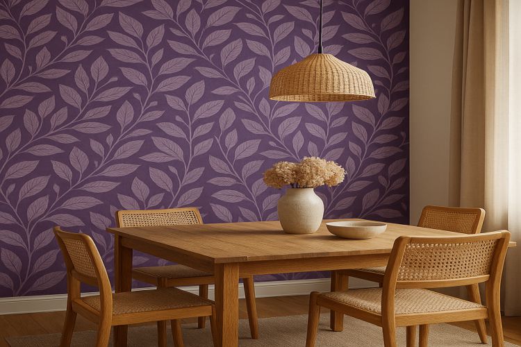
Not ready for four solid walls of color? Anchor the dining table with a single patterned surface. Position it behind a sideboard or buffet so framed art and serving pieces break up the field. A botanical repeat in cream and plum can act like a mural, setting a lush backdrop while the remaining walls stay crisp white or warm gray. For a curated selection of patterns scaled specifically to eating spaces, explore wallpaper for dining room options that balances richness with restraint.
3. Play with Scale and Geometry
Large‑scale prints—think bold ikats or oversized florals—create instant drama and can visually expand a narrow room. Meanwhile, daintier geometrics lend rhythm without stealing the spotlight from your tableware. If the dining area flows into an open concept living space, choose a pattern whose dominant color echoes upholstery or rugs nearby, creating cohesion across zones.
4. Pairing Neutrals and Textures
Purple shines brightest against earthy textures: rattan pendant lights, weathered walnut tables, even matte black flatware. Those natural materials temper the jewel‑toned energy, preventing the room from feeling too “special occasion.” Linen curtains in mushroom gray or off‑white soften light and frame the wallpaper like drapery around a stage set.
5. Don’t Forget the Ceiling
A swipe of pale violet above crown molding can lower optical height and make high rooms feel cozier. If you’re adventurous, choose a subtle stripe in whisper‑thin mauve and cream to mimic a tented ceiling—a nod to classic European dining salons. Keep lighting warm (2700K LEDs), which pushes violet toward dusky romance instead of cool ultraviolet.
6. Extend the Story Beyond Dinner
Purple isn’t only for adults. If your dining area sits next to a breakfast nook or homework corner, bring the color family across the threshold with a lighter, playful print. A dash of purple wallpaper for kids on an adjacent wall—or even inside cabinet backs—creates a visual echo that ties the household together without repeating the exact pattern.
7. Practical Matters: Prep and Maintenance
Bold pigments can accentuate wall imperfections, so spend time skim‑coating and priming. Use a high‑quality adhesive or peel‑and‑stick variant suited for textured surfaces if your home is older. Most modern papers are wipeable; a quick swipe with a damp cloth keeps spaghetti‑sauce splatters from becoming permanent art.
Purple in a dining room is like the unexpected spice in a signature cocktail: subtle enough that guests can’t always name it, powerful enough that they remember the experience. By selecting patterns that respect your architecture, balancing deep tones with airy finishes, and echoing color stories throughout adjacent spaces, you’ll turn every meal, from Sunday brunch to midnight snack, into an occasion worth savoring.

